Personal finance using RNotebook
08 Jan 2019
One of my new year resolutions 2019 is to improve the automation of my personal life, including tracking my finances. Fortunately, I have been tracking my expenses over the last 9 months since April 2018 and now I have the data to generate a summary report about my income and expenses, in order to produce a budget for 2019.
I attended a workshop on R, RMarkdown and RNotebook and found that RStudio is quite an integrated R development environment. It is easier and seamless to use, compared to Jupyter. However, I am not familiar yet with the detail functionalities of both of the tools and unable to provide an extensive comparison between these two tools. From the user experience perspective, I find RStudio is seamless, it does not require me to start the web server and can render on the fly from my RNotebook to PDF or HTML format.
Being new to R and RNotebook, I thought it would be a good idea to learn more R by using my finance data (Extracted from database) and produce reports and charts using RStudio.
Experience
Here are some libraries that I found useful:
library(dplyr)
library(ggplot2)
library(grid)
library(gridExtra)
library(magrittr)
library(RColorBrewer)
library(reshape2)
library(scales)
The finance data was stored in a database and extracted as csv format. The R code reads in the csv and construct a data frame to generate reports.
ggplot2 is a must-have library that help me immensely in producing nice looking graphics. I love how you can just “append” the plot configuration on top of each other by using + sign. For e.g.
line_plot <- ggplot(data=plot_df, aes(x=df_subexpense$mth, y=df_subexpense$total, group = 1)) +
geom_line() +
geom_point() +
xlab("") +
ylab("Amount ($)") +
scale_x_discrete(limits=df_subexpense$mth, labels = plot_df$group) +
scale_y_continuous(labels=dollar_format(prefix="$")) +
theme(axis.text.x = element_text(angle = 90, hjust = 1)) +
ggtitle(paste(expense_category, dollar_format()(mean_total), sep=" "))
In the example above, the + signs incrementally add another feature on top of a working plot, by adding xlabels, ylabels, themes, etc. It is quite neat.
Being new to R, the piping symbol %>% when working with dataframe is indispensable. It makes the code succinct and yet readable.
Samples
Here are some samples from my report (amounts were removed for my privacy):
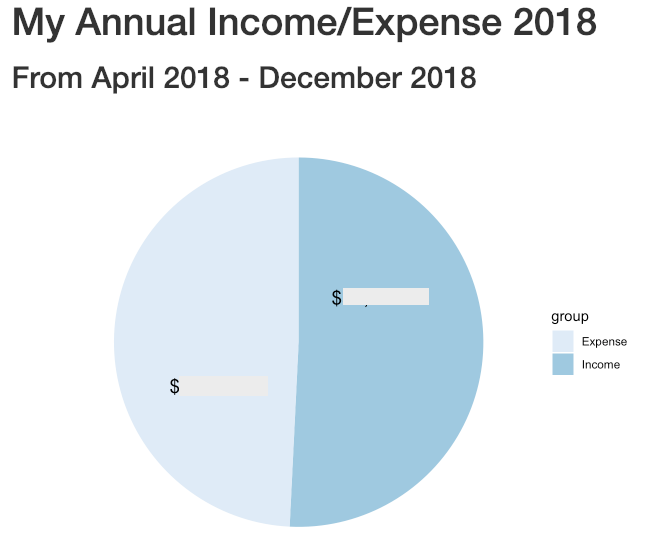
This is a high-level pie chart that shows my income vs my expense. Looks like I might not have any savings (leftover) last year.
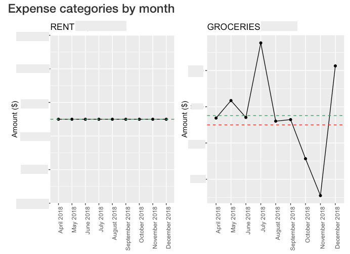
These plots breakdown my expense categories by month so that I get an overview of how the expense fluctuated every month. It helps towards my budgeting this year.
There are other plots that I am unable to show here because it just take a lot of work to mask the amount.
Summary
Overall, I like RNotebook and secretly hoping that Jupyter has the equivalent integrated editor that makes it fun to code/perform analysis with Python.